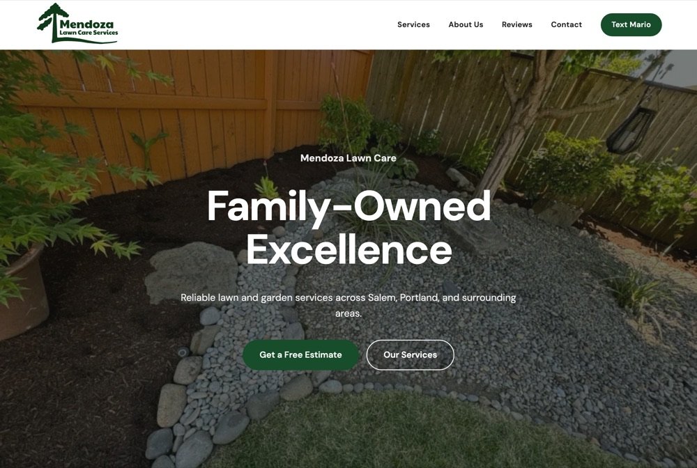
Mendoza Lawn Care
Lawn care and landscaping in Salem, Oregon. Services, customer reviews and a phone number you can tap from the yard — built so the neighbours looking for yard work can find him.
Visit site →

Two things, done properly: the website people find, and the brand they see before they ever meet you. Below, each on its own side.
A selection of the work. There is more we cannot show yet: projects still under way, and brands waiting for their owner to launch them.
Open them and use them on your phone — that is the version that matters. All but one are out in the world; the last one stayed a concept.
Lawn care and landscaping in Salem, Oregon. Services, customer reviews and a phone number you can tap from the yard — built so the neighbours looking for yard work can find him.
Visit site →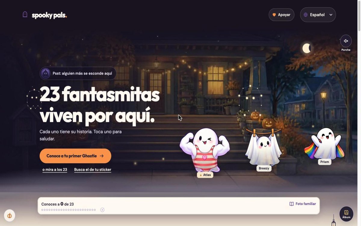
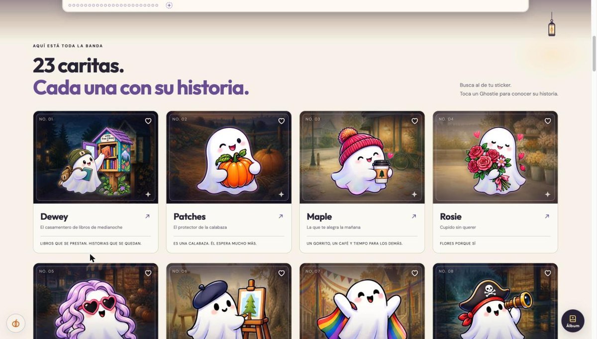
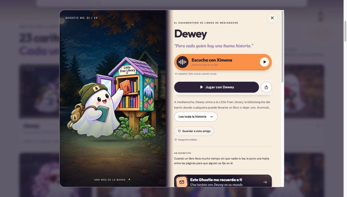
A Halloween street where 23 ghosts live, each with a story and a game of its own. Built mobile-first and bilingual, with a moon that fills up as Halloween gets closer, stories read aloud, and a family photo where a ghost only lights up once you have played its game.
See inside →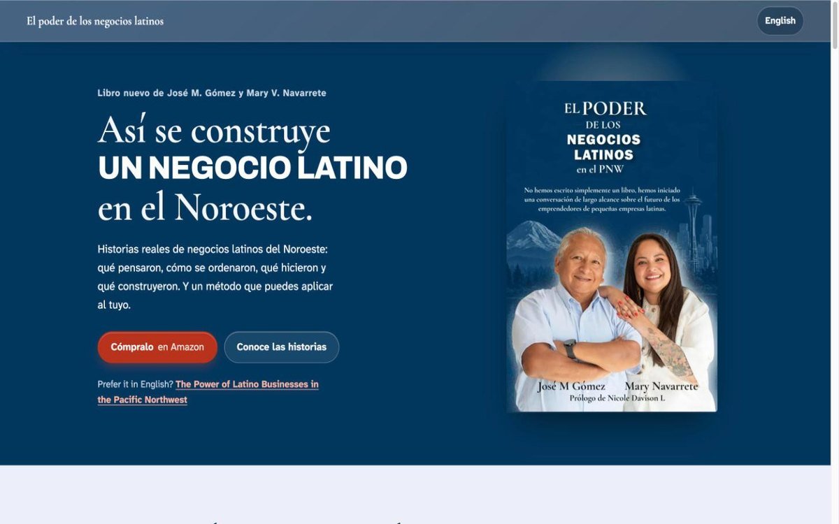
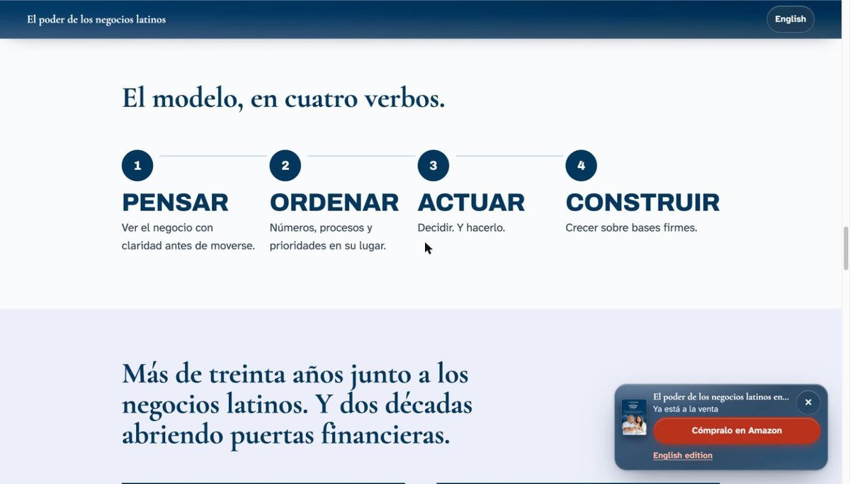
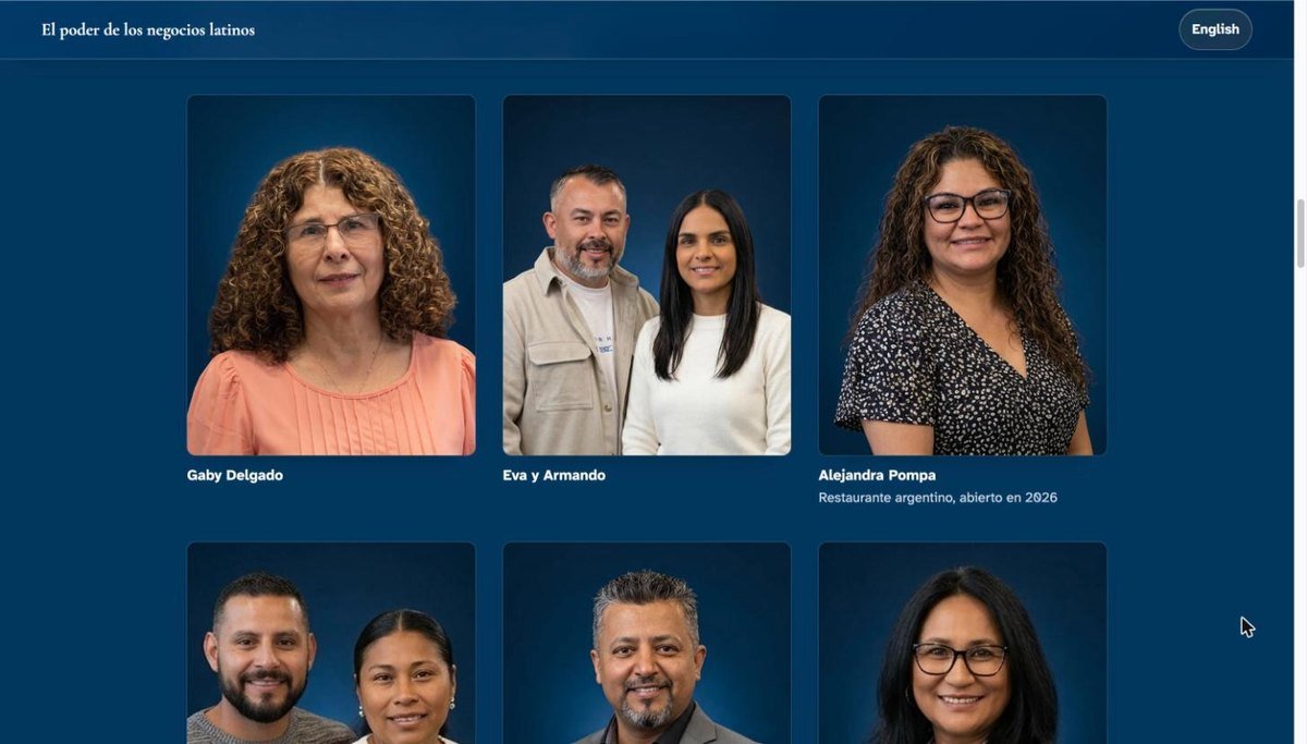
Landing page for a book about Latino-owned businesses in the Pacific Northwest, written by a business advisor and a credit union executive. One page per language — not a translate button — with the real stories from the book, the four-verb method it teaches, and a direct line to buy it.
See inside →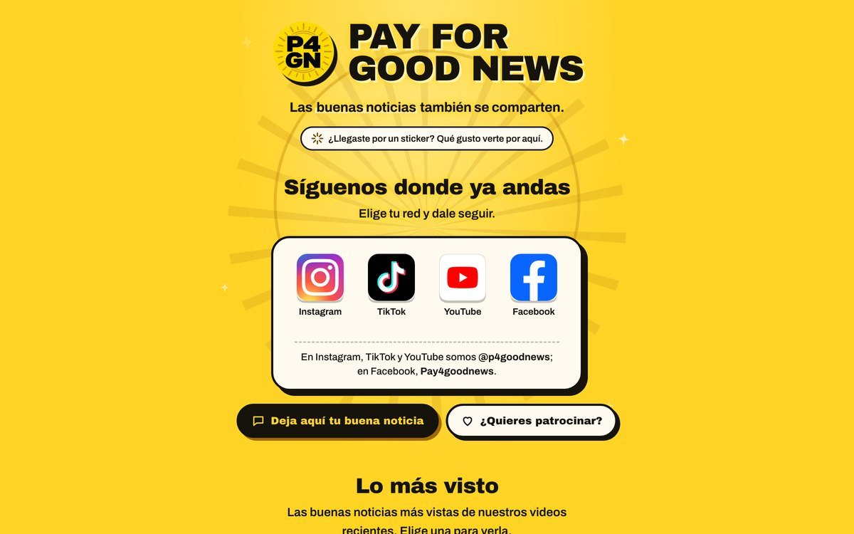
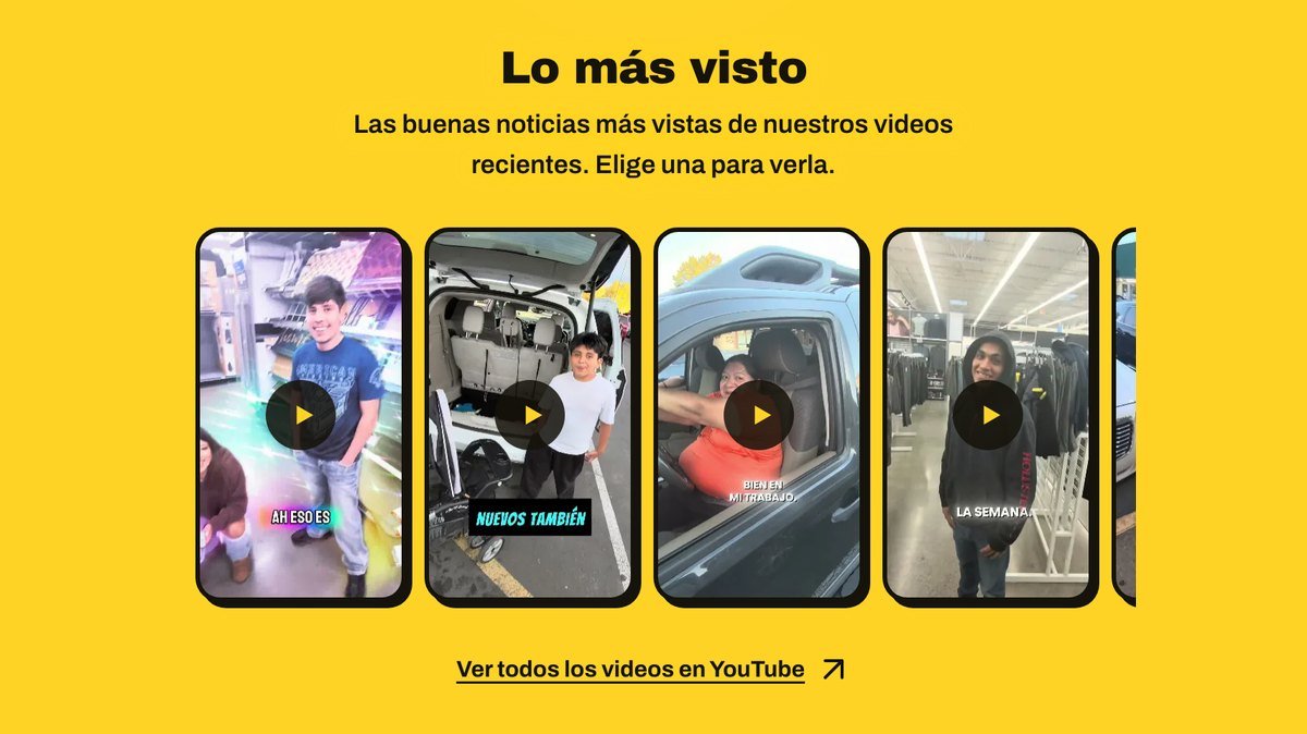
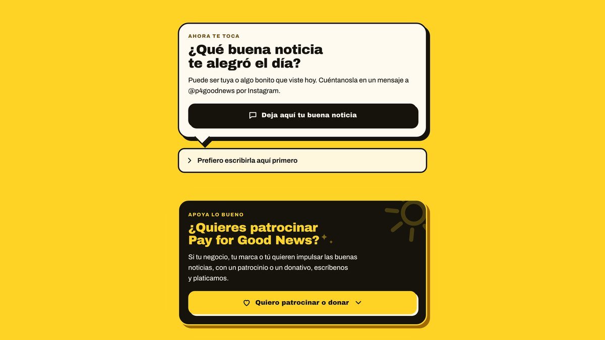
In-house project: a community that shares good news on video. The page is the short stop between a sticker on the street and the accounts — it opens with the follow buttons, carries a carousel that fills itself with the channel’s most-watched Shorts, and a message box that stores nothing: you copy your text and send it from Instagram. No cookies and no third-party trackers — the counter is ours, and each sticker carries its own code so we know which one brought people in.
See inside →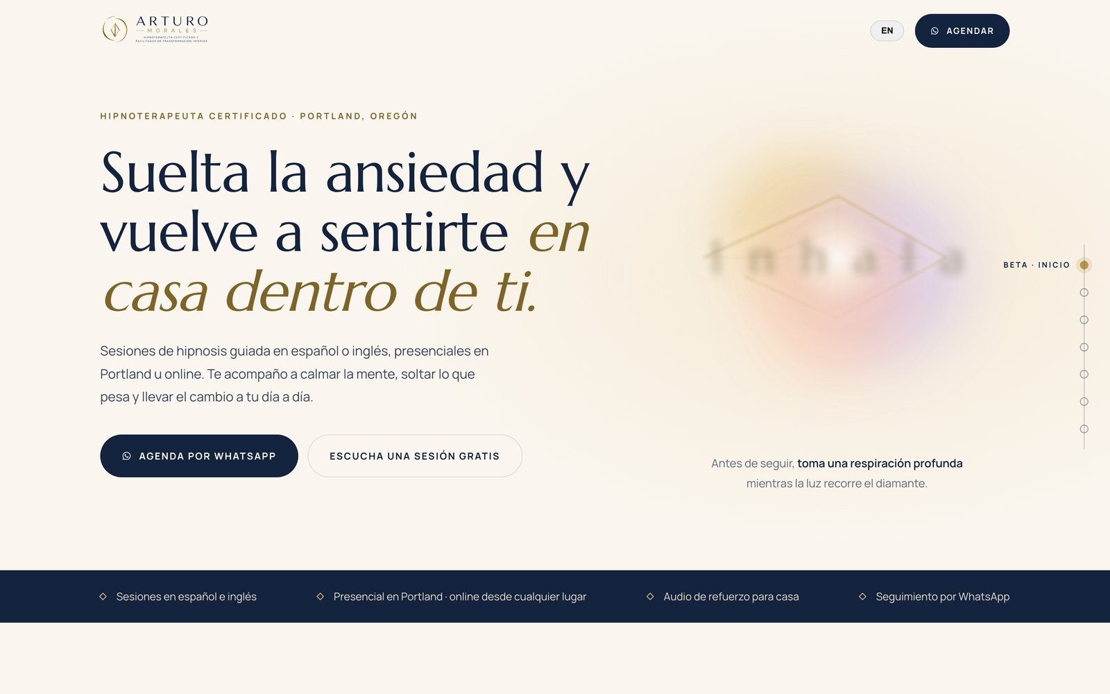
Bilingual site for a certified hypnotherapist in Portland. Sessions in Spanish or English, a free audio session as the way in, and booking that goes straight to WhatsApp.
Visit site →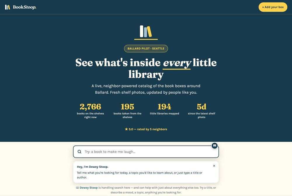
A map and directory of little free libraries in Ballard, Seattle, with photos of the shelves so you can see what is inside before you walk over.
Visit site →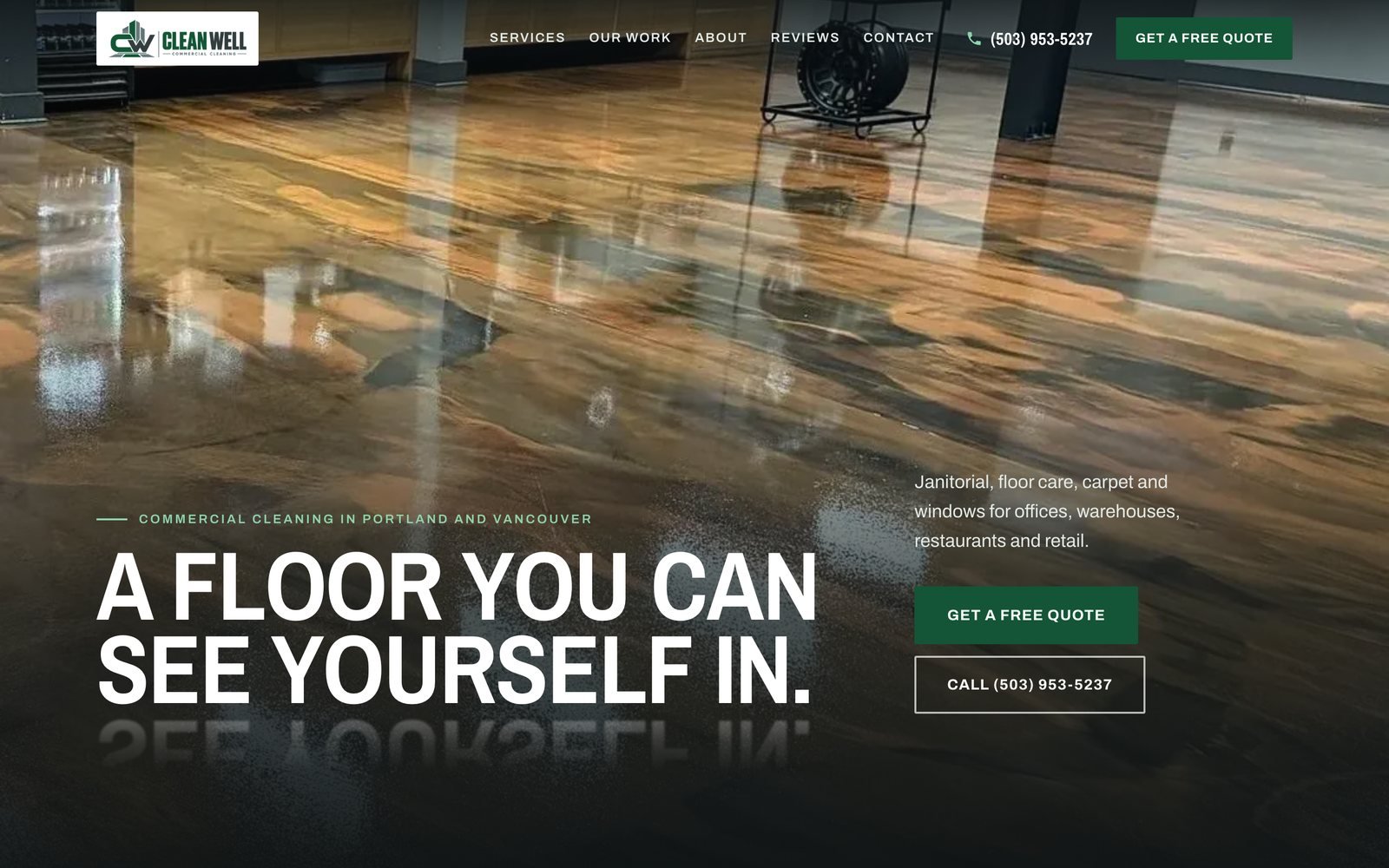
Commercial cleaning in Portland and Vancouver. Thirteen pages — services, work, about, reviews and contact — with a quote form, call buttons that work from a phone, and a panel where the owner reads the enquiries that come in.
Visit site →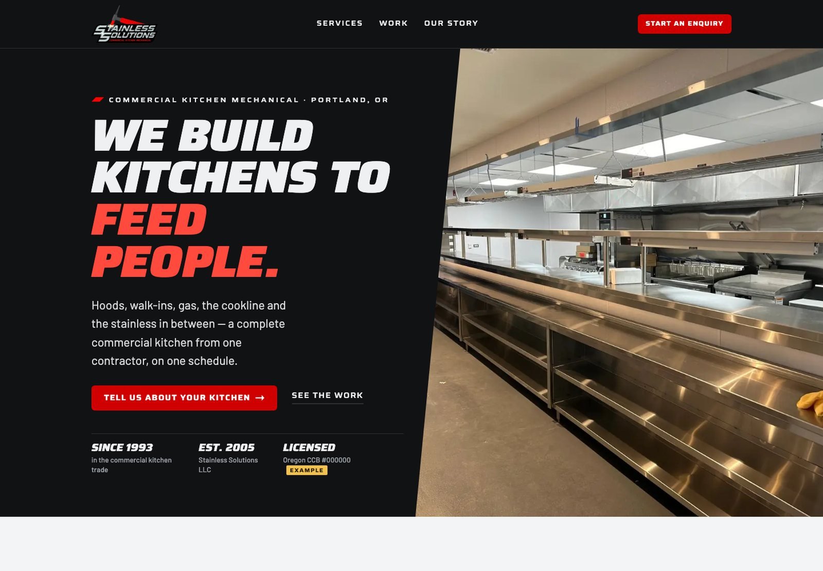
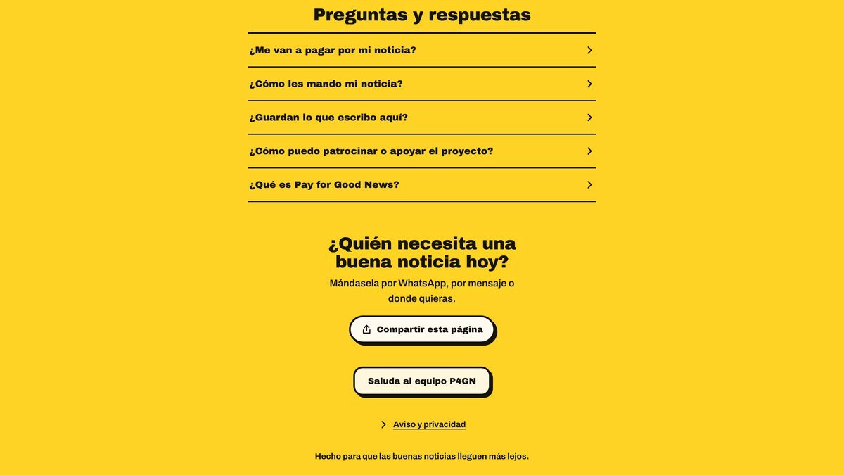
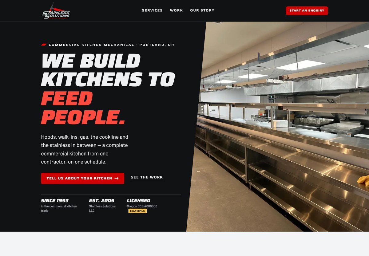
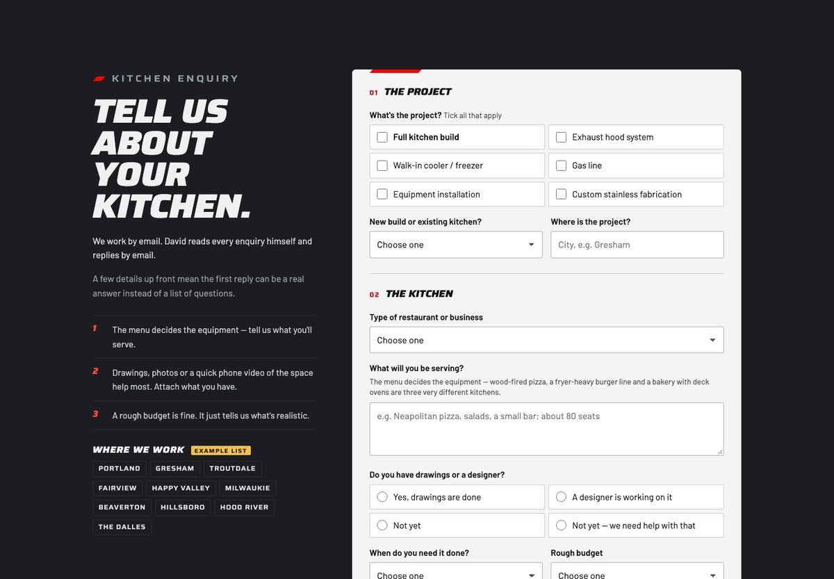
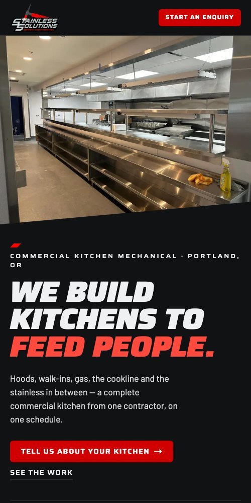
Website concept for a commercial kitchen contractor in Portland, designed specifically for him. Steel and shop-floor red, and an enquiry form that asks what a kitchen job actually needs — hood, walk-in, gas line, drawings, the rough budget — so the first reply can be a real answer instead of a list of questions. It stayed a proposal; it was never published.
See the concept →Work that had to survive a truck door, a print shop and a two-centimeter favicon — not just a slide.
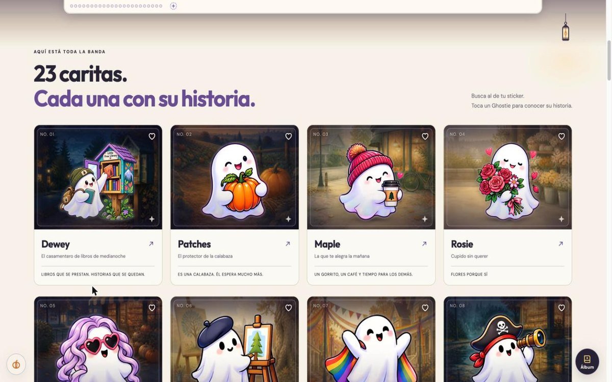
Twenty-three ghosts, each one a character and not a variation: the one who sorts books at midnight, the one who holds the pumpkin, the one who brings coffee. Every one has its own scene, its own palette and a line that says who it is — plus printed stickers so a kid can find their own ghost on the website.
See the cast →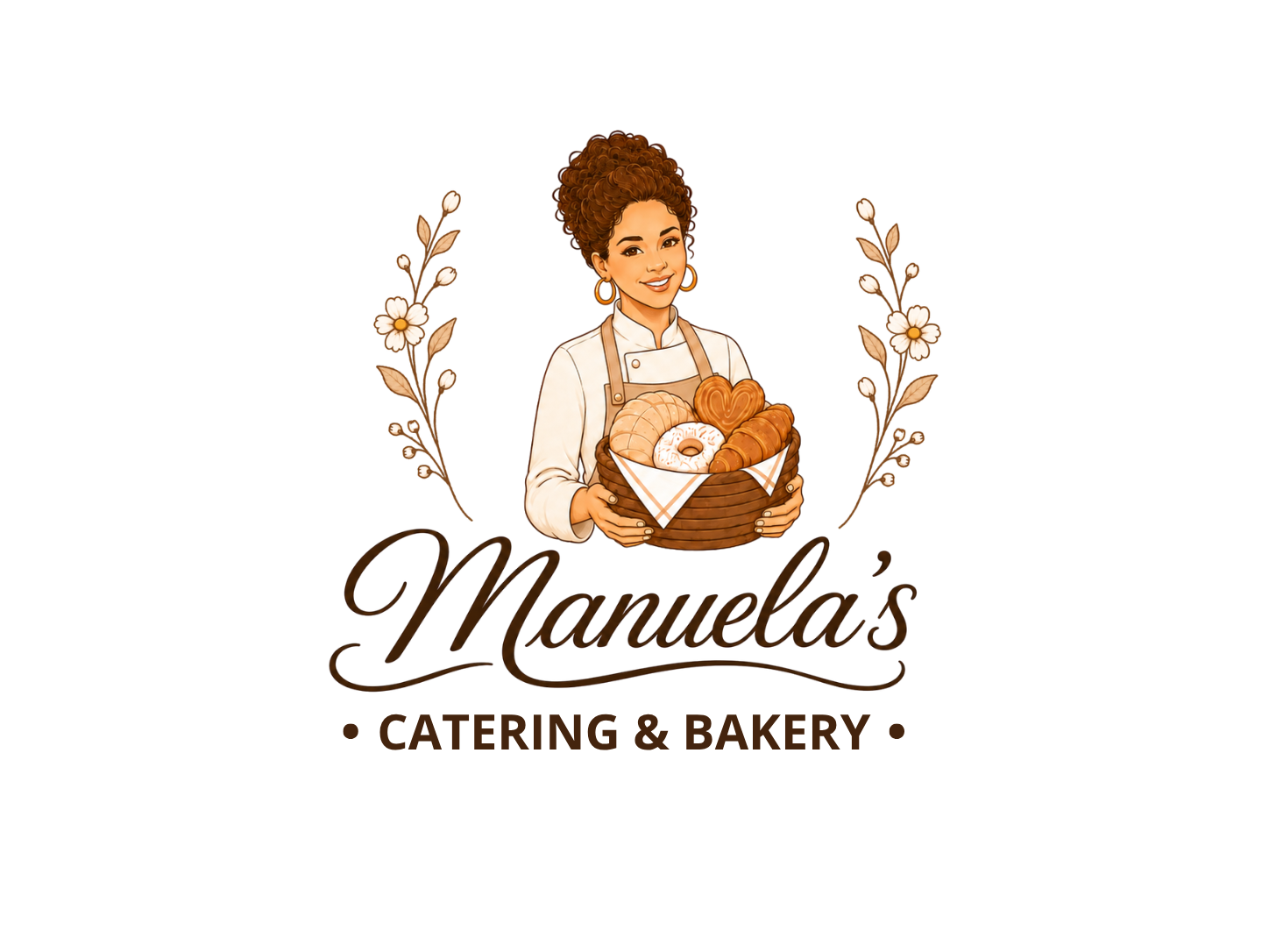
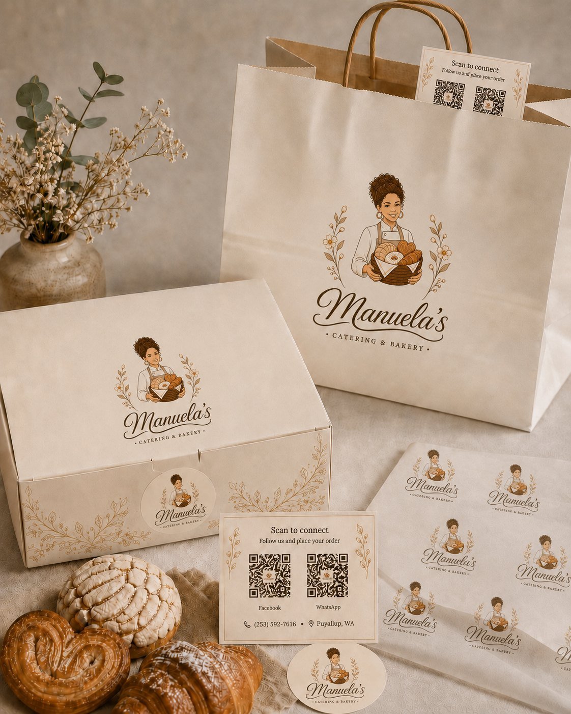
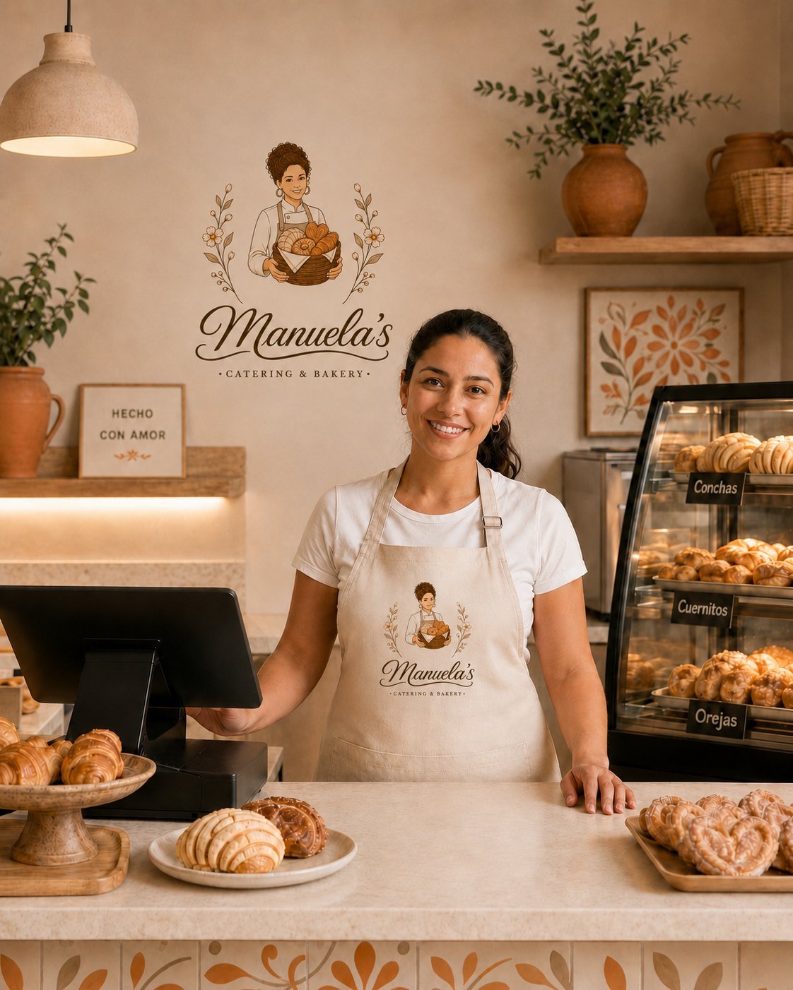
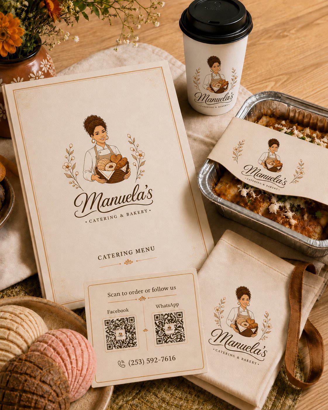
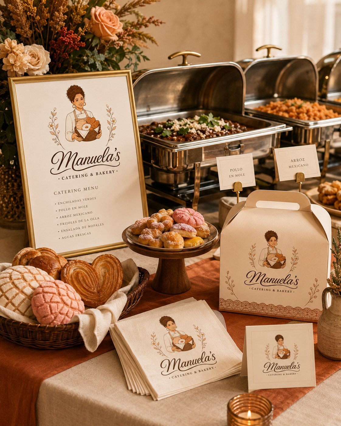
Full identity for a Mexican bakery and catering business — logo, business cards, flyer and sticker. A mark that puts Manuela the baker at the center, with a basket of pan dulce and a script face for the name.
See the brand →
Mark for a commercial cleaning company in Portland. A monogram built out of the buildings they clean, in a green the owner picked himself after three rounds. The printed pieces are still in design.
See the brand →
Personal identity for a certified hypnotherapist: a gold diamond held inside an open ring, a serif wordmark and a line that says what he does. Built to hold up on a website, a business card and a YouTube channel.
See the brand →
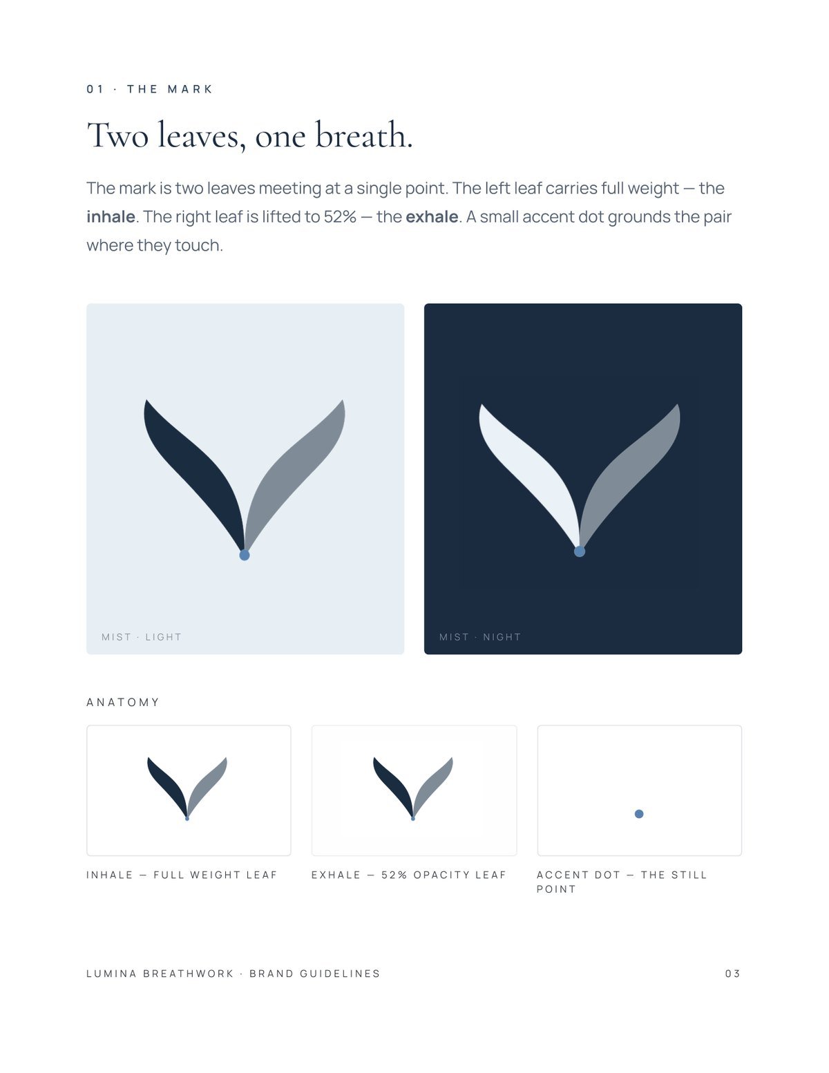
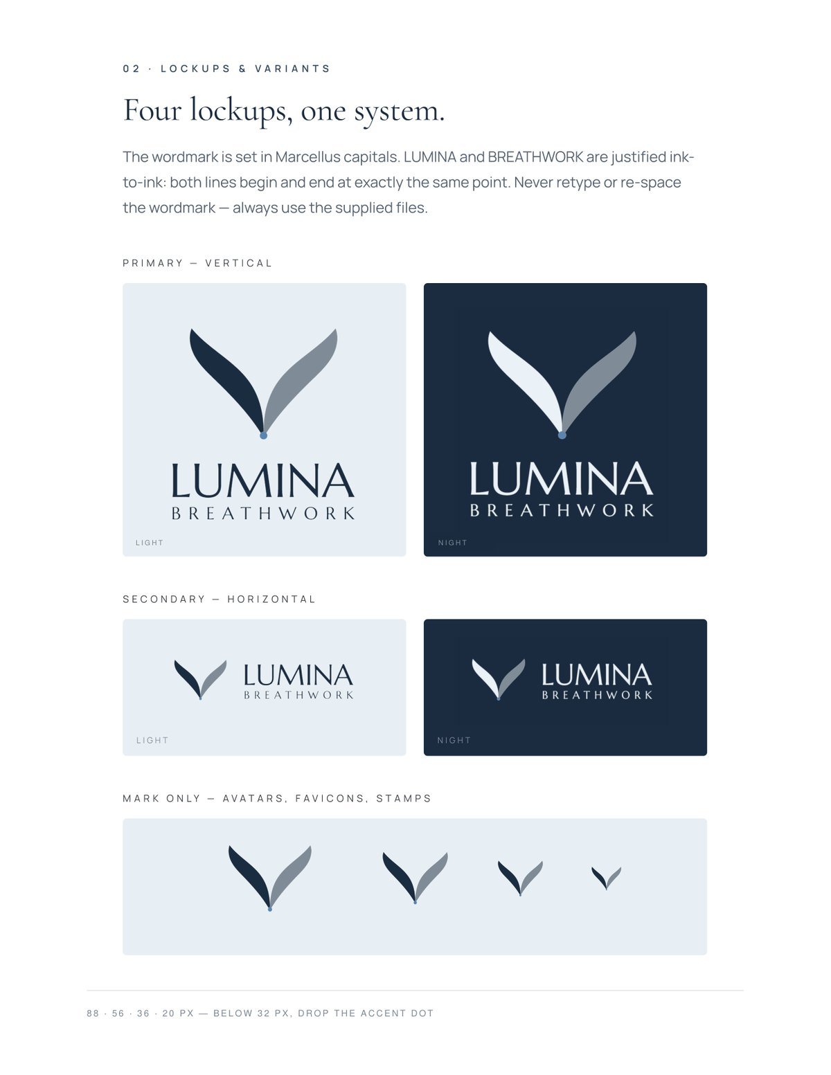
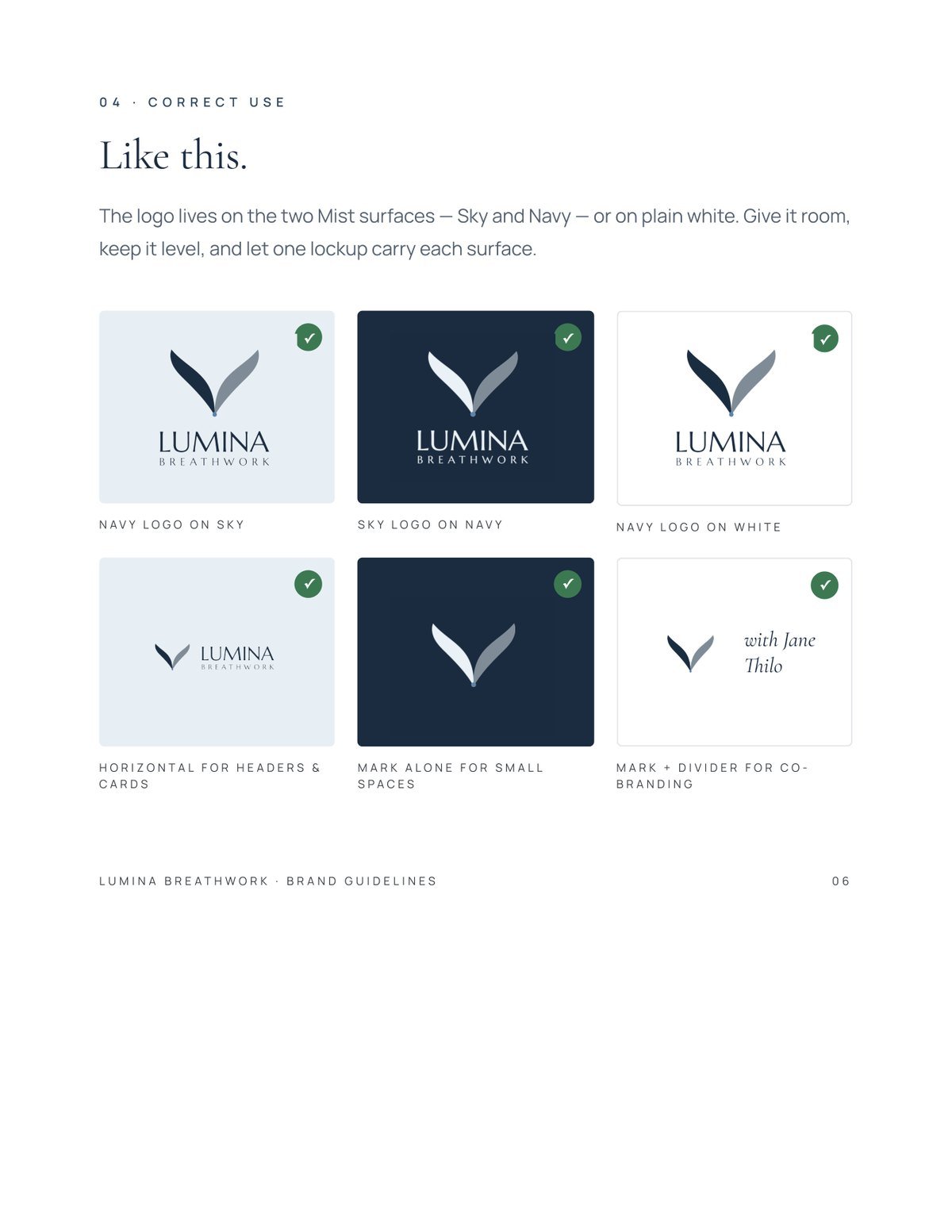
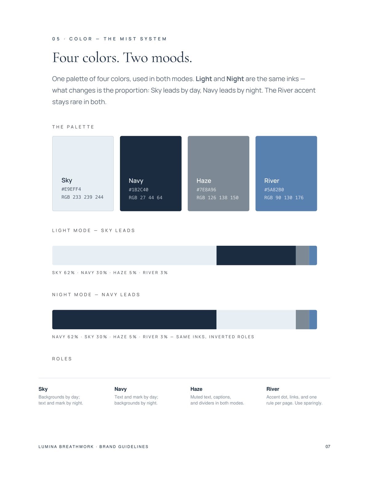
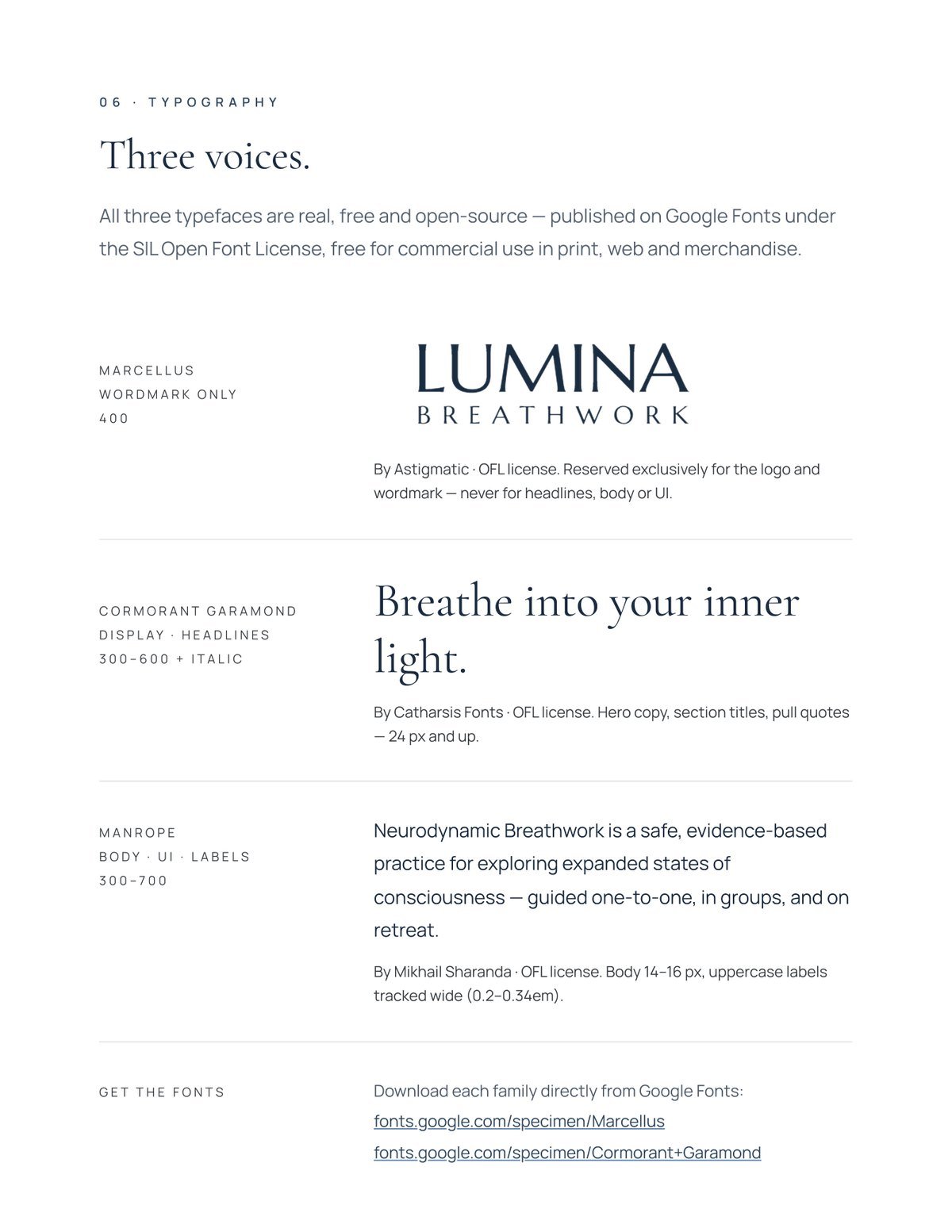
Identity and brand guidelines for a breathwork facilitator. Two leaves meeting at a single point — the left one full weight, the right one at 52% — with the name in Marcellus capitals and a four-colour system that works by day and by night.
See the brand →
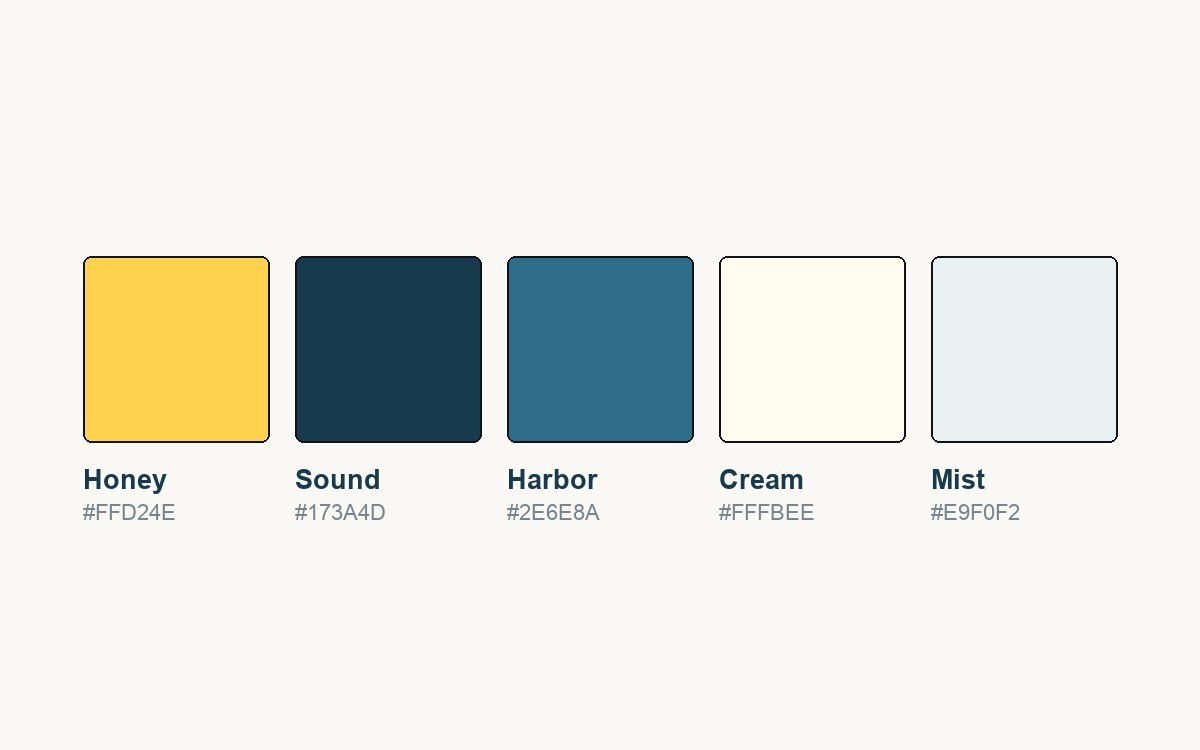
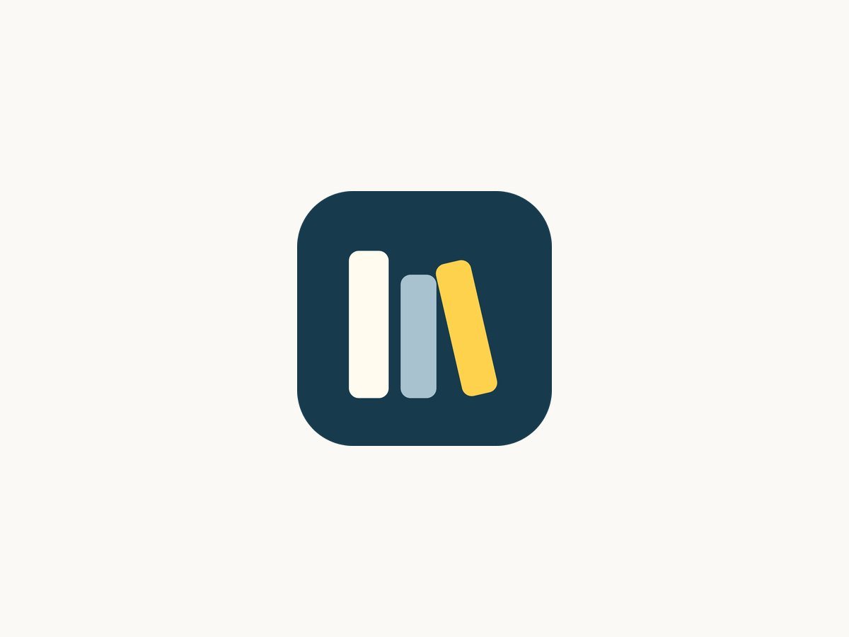
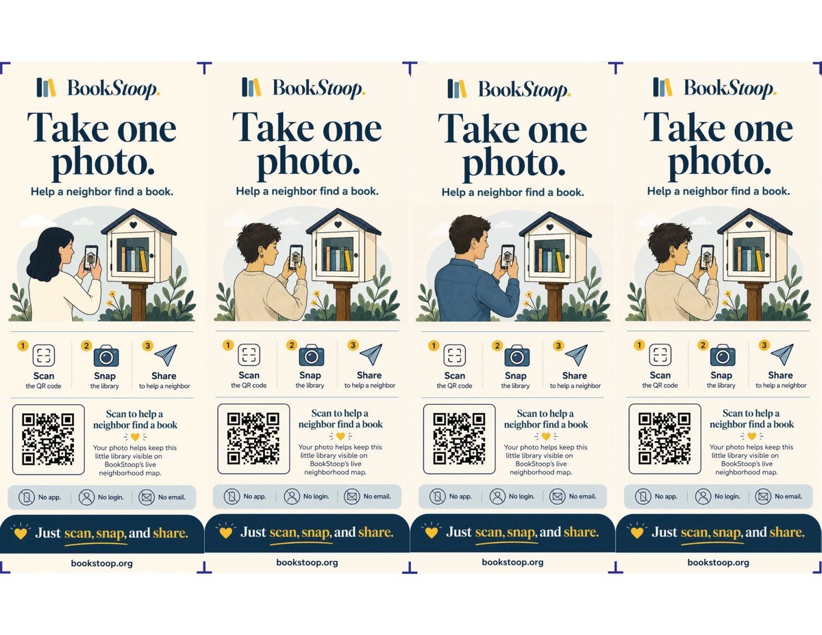
Identity for a neighbourhood catalogue of little free libraries in Seattle. The mark is two books — one standing, one leaning on its neighbour — in a honey-and-deep-water palette. Then the part that had to survive outdoors: a sticker for the library boxes, one instruction and a QR that opens the map, printed four to a sheet with crop marks.
See the brand →Tell us what your business does and we will tell you — free — what we would build and what it would cost. No commitment, and a person reads it, not a robot.